Selected colour swatches
You can order up to 20 colour swatches
How to test a colour scheme
When you’ve spent ages choosing a paint colour, the next step is to test it on the walls. These tips will confirm you’ve made the right decision.
Those little paint swatches or dipped lolly sticks may have you channelling your inner interior designer, but when it comes to getting a real idea of how your chosen colour scheme is actually going to play out, the fact is they’re simply not big enough for the job.
Sample pots are well worth the money. British Paints Sample Pots are a generous 500ml, which will allow you to paint a larger area (at least 30cm x 30cm is recommended). Don’t forget to do two coats, as this is what the final painted wall will most likely have.
You can apply paint to larger sheets of cardboard or paper, or if it’s a new wall, you may be able to get off-cuts of the plasterboard. But by far the best way to test your colour is to paint directly onto the wall. This will give the most accurate representation, as it takes into consideration the texture of the surface, and the way the paint looks when it is absorbed into the wall. (This is especially important on a textured surface, such as an exterior wall.)
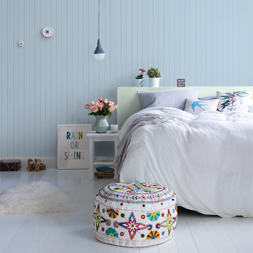
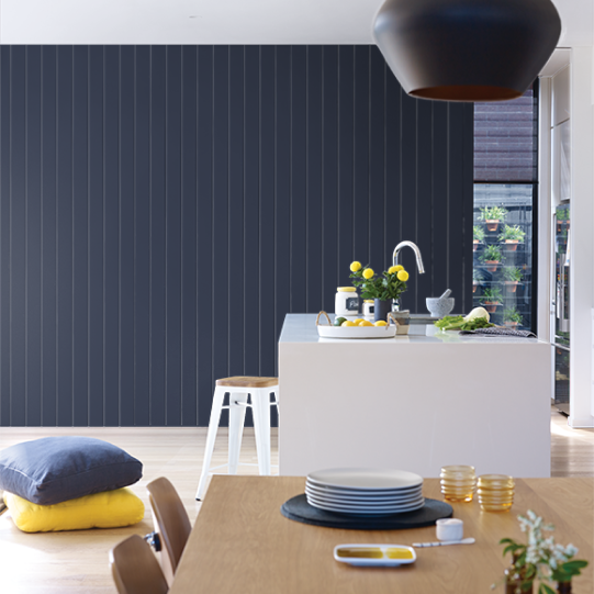
Remember, if the wall is not white to begin with, colours can trick the eye. Your chosen colour will appear darker against a light backdrop and lighter against a dark backdrop. In this case, it can be helpful to tape white paper around the swatch area, so the existing colour doesn’t distort the result. Similarly, if you’re testing two or more colours for the same room, make sure your painted areas are a good distance apart. Stripes of adjoining colour will look cute on Instagram but will confuse your brain with all the different messages from your eyes.
OK, so now your sample colours are on the wall. Job done? Not quite.
Paint a swatch area on different walls. Those that get full sun will reflect the colour, and those that don’t will appear more intense. Look at your sample painted areas at all times of day, so you can see how it changes as the sun rises and sets. Light coming in will also be affected by what’s outside the window – if you have lots of trees for example, pale colours can take on a greenish hint when the sun is shining through them.
Finally, look at it at night under artificial light. If you’re renovating, have your lighting in place first, so you can see how it’s going to look when the mood lamps are lit, or the downlights are on full beam.
Tempted to cut corners with an online colour tool? These are an excellent starting point when you’re choosing a colour scheme but no matter how accurate, your screen will add its own spin. Nothing beats seeing the real thing.